UX Design Success Story: The Viewport Module

Discovering Complexity: Software for displaying 3D worlds and manipulating 3D objects often becomes complicated very quickly. Attention is mainly focused on a central viewport, which is often configured in various layouts, with multiple views (top, front, side, and perspective). Adding more and more features and ease of use problems will occur.
Product Management and Application Engineering teams assigned me the task of improving the user experience of their 3D point cloud software, shown in Figure 1. They planned on making a full overhaul of their centerpiece application and had decided to use a ribbon interface, similar to what appears in Word and Excel.

Exploration: Although ribbon tabs are a more advanced and modern UI control tool for improving software access and organization, they lack the contextual focus I was looking to add to the central 3D viewport.
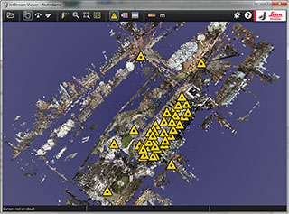
Simplification by Information Architecture: In researching the UX of other 3D applications, I found graphical viewports with their own toolbar menus, containing commands that were particular to 3D viewports, such as camera properties and rendering styles. Obviously the viewport controls should be attached to that window, not buried off in some far away menu (Figure 2).
Standardization: The UX design advantages of a modular 3D viewport were accepted by PM and AE teams, and we next studied popular fly through navigation methods. We looked at real time 3D navigation in 1st person games, and gaming engine navigation standards, arriving at our own best practice mouse and keyboard methods of moving through the 3D worlds of large point clouds.

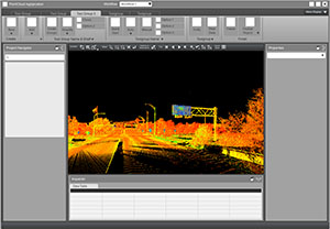
Modular UI and Software: First we developed the 3D viewport as a standalone viewer, providing a showcase for new point cloud streaming technology, as well as a handy previewing and debugging tool. This was a major step and victory in rewriting the overall application. Developing the viewer module enabled it to be added to larger application frameworks with higher level ribbons and menus customized for much more complex operations (Figure 3), such as CAD, point cloud clean up and registration. See the implemented UX design for the standalone point cloud viewer in this online video: Leica JetStream Viewer 1.0