UX Design Success Story: Visual Redesign and Functional Regroup

Discovery: When TruView was first introduced, the online 360 scan publishing and viewing tool was a success, and perhaps a victim of its own success. It became widely used by B2B customers to share 360 panoramic views of their laser scans, measure and mark them up.
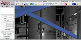
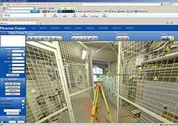
Exploration: Assigned the task of upgrading the UX, I first noticed the visual design needed a facelift. The icons looked inconsistent, as though borrowed from a various sources. They were not clearly grouped or coupled with screen interactions (Figure 1). The open structure of the distributed software permitted end users to customize the interface, so Leica's ownership of the software could be obscured (Figure 2).

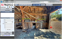
Revision 1 - Information Architecture and UI Refinement: My new version would have a toolbar with functional groups of icons clearly labelled. Icon groups on the toolbar are matched with screen view measuring, markup and saving functions on the left sidebar. I made the left sidebar an accordion style menu that could be collapsed to enable a larger view of the 360 panorama screen. The toolbar was further cleaned up as accordion menus. For tablet interaction, a collapsible navigation tool was added at the right. Numerous hifi color mockups were made in Illustrator and Photoshop. From those, icon sets were delivered to the Application Engineers to implement (Figure 3). We provided space for users to add their own branding watermark (a transparent PNG file) to the lower right corner of the viewport.

Revision 2 - Robust Performance: The first versions of the panoramic software had limitations, running only on Internet Explorer with the installation of our plugin. The next generation is a major rewrite, now running on all browsers, tablets and mobile devices. I provided UX research and visual design on this current version as well. It was rewarding to take part in the successful evolution of an amazing software product. Experience TruView here.